
Korean Web Design Company: What Should a Global Business Website Include?
A Korean web design company should help a business explain its offer and make the next step easy for the right audience.
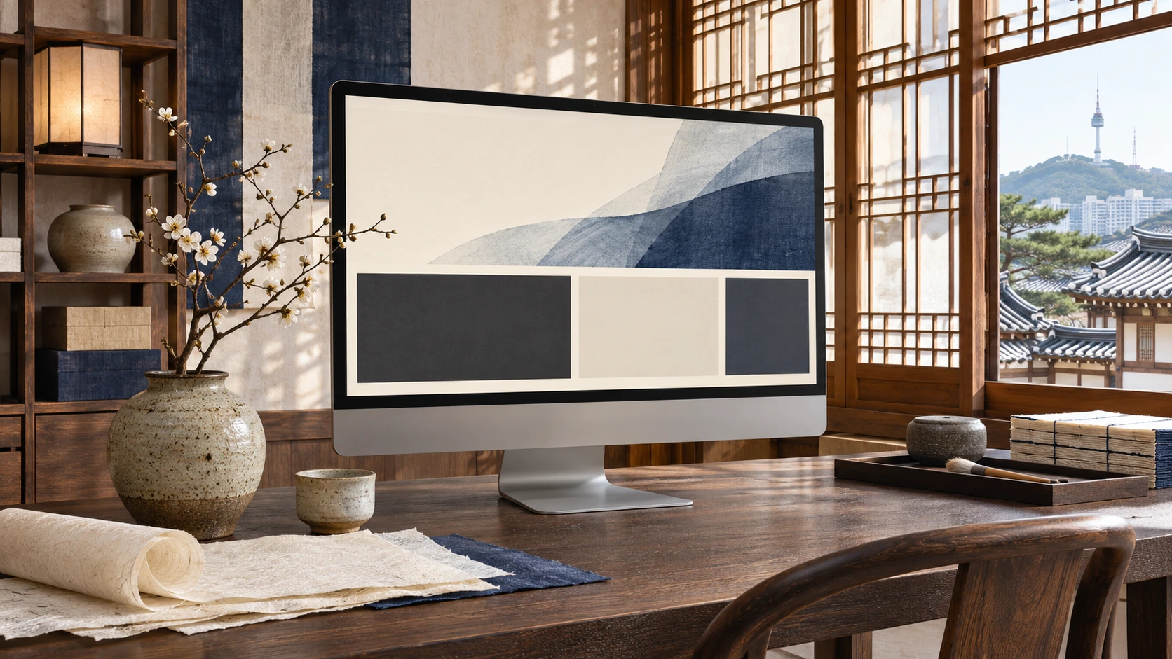
A global website needs a clear business purpose
A Korean web design company should help a business explain its offer and make the next step easy for the right audience. A visually striking homepage matters, but it cannot replace clear services, credible information and a usable inquiry route. Decide what the website must help a visitor accomplish before choosing the layout.
A Korean manufacturer seeking overseas partners may need a different structure from a service business generating project inquiries. A creator-facing campaign may need another route again. The website should make these paths understandable without asking every visitor to read every panel. Global reach begins with a useful experience for a defined audience.
A useful site blueprint
Connect the parts around the same audience and the next useful action.
Make the offer understandable in the first screen
The opening section should identify what the business does, whom it helps and why the visitor should continue. Use a specific service or category phrase, then support it with a benefit the business can substantiate. An attractive slogan alone may leave a new visitor uncertain about the actual offer.
Photography and typography should reinforce that explanation. A relevant, sharp image can set the tone; a large decorative image should not push essential information beyond reach. Keep the main next action visible and understandable. For a partnership site, introduce the opportunity rather than using a generic button that conceals what happens next.
Build service pages that stand on their own
A visitor can arrive at a detail page without seeing the homepage. Each important page should explain the offer, audience, useful outcomes, included work and next step. Link to relevant examples and related answers where they help. Do not rely on the header menu to carry the entire explanation.
Keep the hierarchy clear: parent categories introduce the service family, detail pages explain the specific work and articles answer supporting questions. The templates can be visually consistent while the content stays unique. A page should not exist only because a menu needed another item.
Plan bilingual pages as part of the design
Korean and English can need different line lengths, navigation labels and explanation. Plan equivalent page relationships and a language switch that preserves the reader's context. Review the forms, confirmation messages and linked destinations in both versions.
The design should accommodate the actual text instead of shrinking one language until it fits a rigid box. Use a clear content inventory and assign ownership for keeping the versions accurate. Language architecture and technical settings need implementation review; the visual language switch is only the part the visitor sees.
Design the mobile journey deliberately
A desktop page should not simply become a long stack of oversized panels. Decide which information the mobile visitor needs first, shorten repeated introductions and use clear headings to make the rest easy to scan. Cards can use multiple columns only when the text and controls remain readable.
Test the menu, image crops, inquiry form and language switch at representative widths. A beautiful screenshot does not prove the form can be completed or that the sticky navigation leaves enough space to read. Review important tasks on actual devices when possible.
A practical website planning sheet
Before approving a template, make one row for each important page. Record the intended audience, visitor question, main evidence, next action, language pair and owner. This exposes gaps that a visual sitemap alone may not show. A campaign page may have attractive panels but no defined inquiry; a service page may have a clear title but no information a buyer can use.
For a hypothetical Korean manufacturer looking for overseas creator partnerships, the first priority might be a credible brand introduction and a focused opportunity form. A long ecommerce catalogue would not automatically serve that immediate task. If the business later adds direct sales, it can plan the product, payment and fulfillment journey as a separate requirement.
Use the sheet during design review. Open each page as a new visitor and ask whether the intended task can be completed with the information available. Check both languages and a narrow mobile width. Assign the missing material to a real owner instead of leaving placeholder graphics in the final layout. This process makes the design more useful without requiring every page to become longer.
Agree on ownership and the launch checks
The project should leave a maintainable site, not only an approved design. Confirm who updates the content, manages forms, checks important links and reviews performance. Keep hosting, account access, source files and any third-party dependencies clear in the scope.
Before launch, verify the intended pages, language relationships, search settings and inquiry delivery on the production domain. Do not describe a draft preview as a publicly discoverable website. Share your audiences, current site and business goals with C3i3 Korea so our team can discuss a design scope connected to the wider marketing work.
Related guides
- Korean English Website Design: How Should You Structure a Bilingual Site?
- Korean Brand Landing Pages: What Turns Campaign Interest into Useful Inquiries?
- Korean Mobile Web Design: How Do You Reduce Scrolling Without Hurting Readability?
- Korean Ecommerce Web Design: What Should Brands Prepare Before Selling Globally?
Make this guide your working brief
Tick what you have reviewed, then download your notes for your team. This tool runs in your browser.