A coherent first impression
Bring logo, color, typography and image direction into a shared system, so each touchpoint feels connected.
 KOREA
Give every product, campaign and customer touchpoint a recognizable visual foundation.
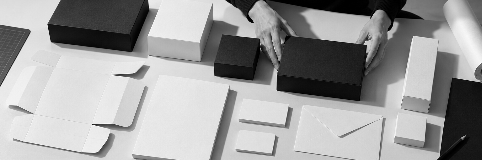
A brand identity should hold together on a product label, creator brief, social post and mobile screen. We start with your positioning, audience and actual materials, then develop a visual direction that supports the way you market. For Korean brands entering the United States and teams working across both languages, we consider type, image selection and layout together. The result is an agreed set of identity assets and practical guidance your team can use consistently.
Explore the fit ↗Bring logo, color, typography and image direction into a shared system, so each touchpoint feels connected.
Consider Korean and English text lengths, type choices and reading order within the same visual direction.
Prepare agreed export formats and application guidance for the people producing your next campaign or product launch.
Your proposal confirms the selected deliverables, language versions, review rounds, timing and fees.
Review your positioning, existing assets and the products or channels where the identity must work.
Compare focused references and agree on a design direction before developing the full system.
Apply the proposed identity to selected packaging, web or campaign examples in the required languages.
Refine the agreed direction, organize files and explain the rules that help future work stay consistent.

A Korean skincare brand may have strong products but different visual styles across its packaging, US landing page and creator materials. An identity project can align those applications around one direction. We would review the existing assets, agree on what to retain and test the system on the materials the launch actually needs.
Illustrative scenario and editorial imagery. This is not a client case study or a confirmed partnership.
Not necessarily. We review the existing identity and its applications first. The useful scope may be a refinement or a clearer usage system rather than replacing the logo.
Yes. We can consider typography, layout and sample applications for both languages. Translation and copy development responsibilities are confirmed in the scope.
These are separate responsibilities unless specifically agreed. We confirm production files, printer coordination and specialist legal review needs before work begins.
Share your current identity and the places it needs to appear. We will help define a practical design scope.
Discuss brand identity